If you follow at least a few tech/dev bloggers and threads, Liquid Glass is all that everyone was talking about in the past week, and deservedly so: Apple introduced Liquid Glass front and centre in the WWDC Keynote, and there are multiple dedicated developer sessions that cover its philosophy and best practices.
I had the affordance to view the first half of the WWDC Keynote while waiting for a ferry to Nanaimo, BC, and formed some opinions on that same ferry without the internet to influence what I should think.
I’ll lead with an assertion that Liquid Glass is a design and engineering feat that probably only Apple could pull off. They understand their hardware and software, and they have control over the SDK and the developer relationship. Culture-wise, you can imagine designers saying, “Hey this is what we want: the button shapes morph and absorb each other, and they reflect the light from outside the draw box. Now go find a way to implement this on every screen we sell”, and won’t get much pushback from the engineers. In any other company, practicality would have stopped this in the track.
I don’t think it’s a byproduct of too many head counts sitting there with nothing good to work on. Liquid Glass set out to solve a few real problems out there, as far as I see:
-
In mixed reality with Apple Vision Pro, a tangible, interactive material that is a valuable thing to have.
-
Liquid Glass is a manifestation of Apple’s push to unify the platforms, from design to development. I think it’s especially important to smaller developers and teams out there, who can’t really afford specialized designers of their apps — they can simply follow some principles and arrive at an app that looks good, fits in right into the system and along other apps, and can extend the codebase to cover more platforms.
This is similar to the push to flatten everything in iOS 7: if you simply use system UI elements, your design will at least look decent. No more tiling skeuomorphic backgrounds!
If you paid close attention to Apple’s iOS 18 rollout, there are traces of OS 26 in the Photos app: there are blurred backgrounds behind what’s supposed to be the navigation bar, and you have these floating buttons where the toolbar should be. This has been brewing inside Apple for at least a few years; it’s not a snap decision that dragged everyone suddenly to this direction.
Liquid Glass gleaned quite some controversy just days into WWDC. If that sounds familiar, so did the rollout of iOS 7 in 2013.
Let’s set aside a few things first, things I deem as “false criticism”:
- Note that OSes 26 (if that’s the correct way to call all of them) are in beta and that anything can be fixed, improved or changed.
- Still-frame screenshots don’t do justice: they can be taken at the worst scroll position, and legibility often improves in a dynamic background. (Although I’ll admit: legibility should be maintained even in still-frame screenshots.)
- You don’t see your fingers in a screenshot or screen capture video. The shapes of an interactive piece of Liquid Glass may appear overly exaggerated without your finger on top. Moreover, it feels different when you are driving the interaction than when watching someone else do it.
- The world, Apple included, is finding the balance. If you recall, it took Apple 5 years, until iOS 12, to gradually walk back the thin-ness that iOS 7 introduced.
- Many people equate new to bad. Don’t be one of them!
With those points out of the way, I’ll share some of my critical points of view.
First, even inside Apple, they have no consistent ideas on when and where to apply the Liquid Glass effect. In the Meet Liquid Glass session, Apple designer Chan Karunamuri remarks at 13:04:
You may be tempted to use Liquid Glass everywhere but it is best reserved for the navigation layer that floats above the content of your app.
But we all see Apple applying Liquid Glass effects on the buttons in Control Center and in passcode pad buttons on the Lock Screen. Inside each individual app, though, the new design seems more refrained from using too much Liquid Glass.
(Also, I noticed that the slab of Liquid Glass that forms the Lock Screen seems to have a stronger refraction of light — there are iridescent colours where whites and blacks meet. I’m not sure if it’s just a special treatment or what, but I was under the impression that the material has consistent thickness and light lensing strength throughout the system?)
Second, the concentric design pattern that complements Liquid Glass leaves too much white space. In the examples below, all looks good in the left screenshot (if you don’t mind the translucency), but as the sheet expands to full height, we are left with some extra boosted paddings on the list contents. Now… this may very well change, but it certainly leaves the developer with less space to present their contents.
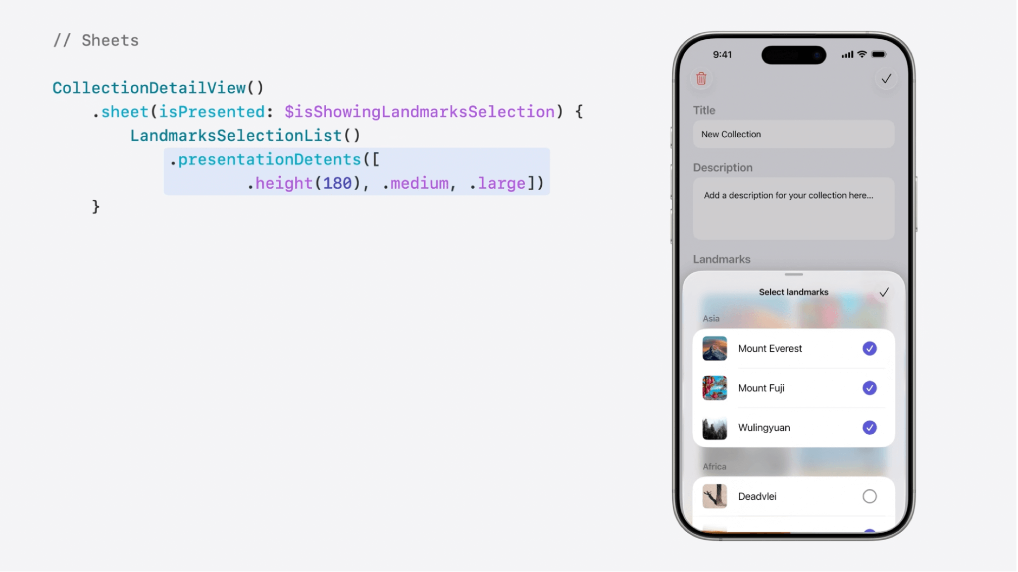
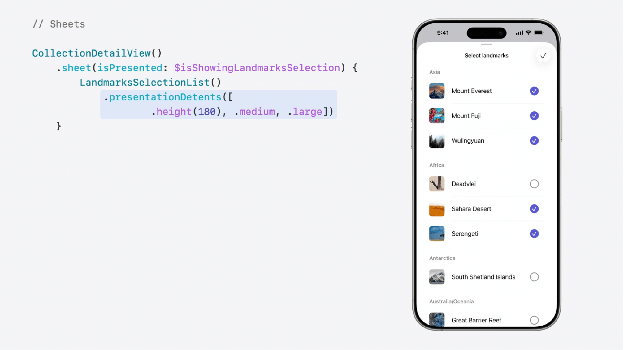 Source: Apple, “Build a SwiftUI app with the new design”, around 6:48.
Third, there are too many jarring transitions. I can’t think of a better word than jarring — the UI elements may morph and morph too much, and that makes the app disorienting even if I literally stay where I am. I don’t have motion sickness but some transitions on the iPadOS 26 make me dizzy. For example:
- Tapping a top-positioned search bar on iPad will hide the sidebar, therefore re-layout the content unnecessarily (screenshots below).
- As you load a page in Safari, the top bar may jump between dark and light appearances as the page loads. Same for many Liquid Glass buttons and bars — they adapt to the contents behind them, but the transition really needs to be more subtle. Heck, what’s wrong with staying dark/light and only increasing the opacity of the button background?
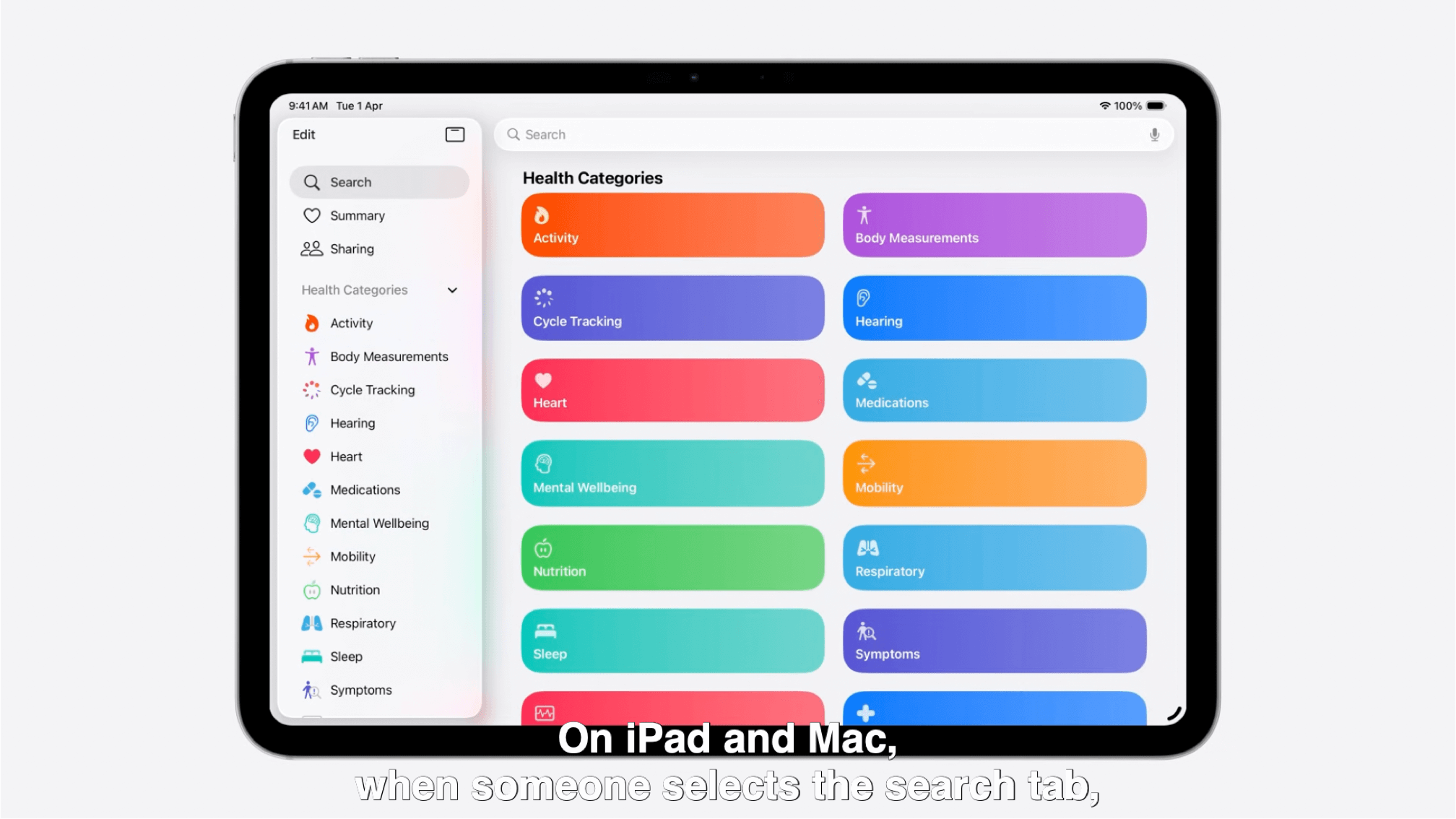
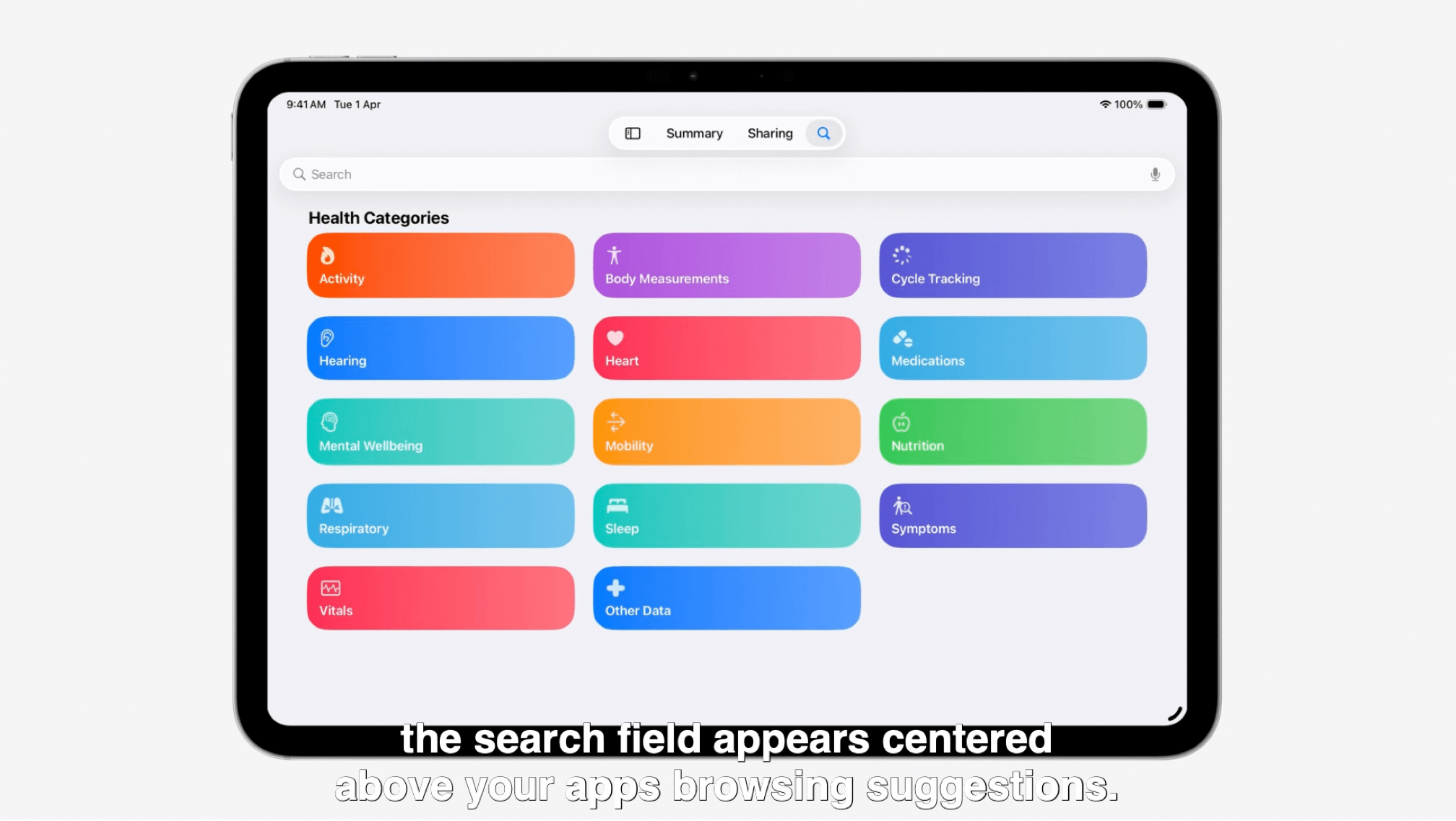 Source: Apple, “Build a SwiftUI app with the new design”, around 13:51.
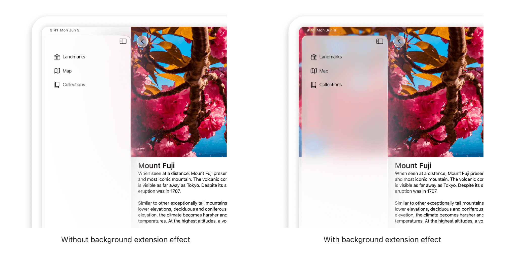
Finally, practicality suffers. Liquid Glass also demanded translucency and continuity of contents that extend beyond visible/tappable areas. One prime example is the sample view below: the hero image extends beyond the edges of the content column and continues underneath the sidebar.
This poses an interesting question: If I use an image in my app, and a significant part of it may or may not be covered by a sidebar, should I be using two image assets? I’ll be more tempted, as a developer, to go the safe route and not boldly have any edge-aligned photos at all!
 Source: Apple, Adopting Liquid Glass.
Overall, I still like the philosophy behind Liquid Glass, and I truly see its merits. Like any good new idea, it needs refinements, and it needs users, designers, and developers to find the balance.
I truly admire Apple for pulling it off: I installed iPadOS 26 on my test 9th generation iPad (A13 Bionic chip), and it runs OK — any glitches or sluggishness seem in line with past beta 1’s, and the iPad doesn’t seem to be struggling to render the Liquid Glass effects. I can’t wait to see what it becomes in September.