We just shipped Version 2026.23 for PlantPal, and it’s a big one. iOS 27 allows us to do some great things with Apple Intelligence and the new Siri AI. You can ask Siri about things that are displayed on your screen, and PlantPal, serendipitously, informs Siri what is being displayed, from a task completion record to a list of plants in your room. You can also ask Siri to do a lot more than before, including checking off or rescheduling multiple tasks at once.
I can go on and on about the new AI features. But today, let’s talk about something that meets the eyes: a new design and colour palette set in ceramic and glaze.
The problem with green
Long-time users know too well that PlantPal has been sporting a green accent colour since its debut. It’s a natural choice for a gardening app. But it has problems.
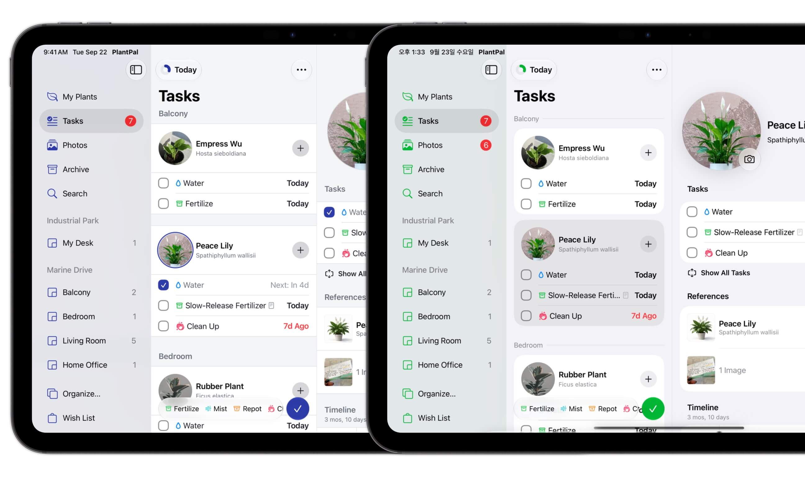
Green competes with your contents. You can build a photo journal of your garden in PlantPal, and your photos are likely rich in different shades of green. The green accent in PlantPal competes for your attention, or fails to get it when your screen is full of lush photos.
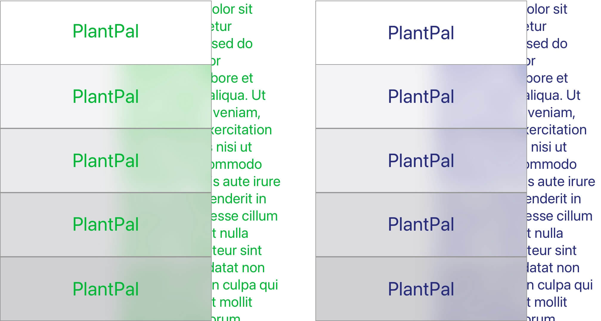
Green is unforgiving. Human eyes perceives contrast primarily with luminance, and luminance is overwhelmingly defined by the colour green: The common formula puts it as 21% red, 72% green, and 7% blue. As a result, it’s incredibly hard to find a shade of green for both character and legibility. It got more challenging over the years where iOS evolved from pure Gaussian blur to Liquid Glass — the “liquidity” is achieved with pixels that go beyond the standard white, and they make any green shade look worse in comparison.
Green is undesiredly semantic. In most cultures, we associate the colour green with Go! and safety. Before iOS 26, all buttons were tinted with the accent green colour, including actions that aren’t as desired. I want something that says “I’m interactive” with more neutrality.
The new ceramic-and-glaze metaphor
I have Claude Design to thank: It quickly validated the tension with green with science, and offered a few directions for the new colour palette: terra cotta, ceramics, neutral charcoal, and a toned-down forest colour for safety.
The ceramic palette was a clear winner because of how the rest of PlantPal looks: clean and minimal. The indigo glaze came next as it pairs well in the gardening scene. Claude Design offered to “cool off” the ceramic tone: any warmth in the ceramics reads as dirty and tainted.
The results are clean, freshly designed app views: different shades of ceramic whites, the indigo glaze accent, as well as shades of ink that serve contents and text.
Reclaiming white space
A good design is timeless, and I think of many iOS 26 quirks as transient, leading to something better. Apple walked back their design system that makes all navigation bars and toolbars “float”, probably because, as we now know, they figured out that iPhone Duo is fine without everything floating.
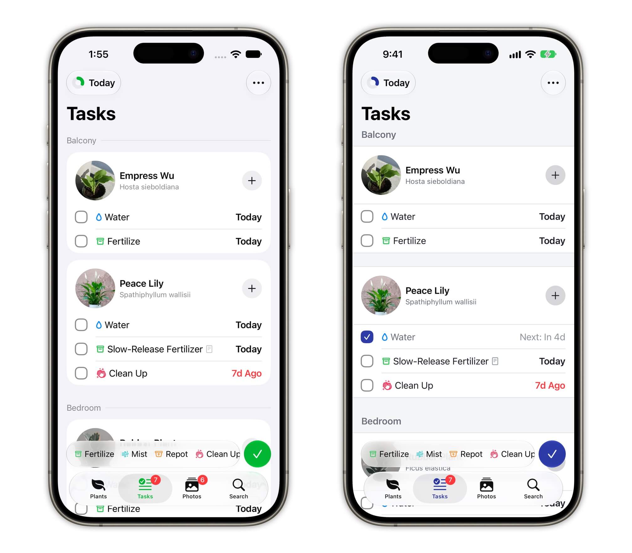
So I’m doing something similar in PlantPal, bringing back edge-to-edge designs where appropriate. Take the example below with the Task List: the new design gave more room to your content, but the same paddings still make the layout breathable.
There are still places in PlantPal where things appear “floating”. I’ll deal with them later in a more collected fashion.
The new app icon
No re-skin is complete without a new app icon. Aside from the green accent, I also updated the potted plant icon that PlantPal has had for almost 5 years. (Yes, it’s based on the 🪴 emoji.)
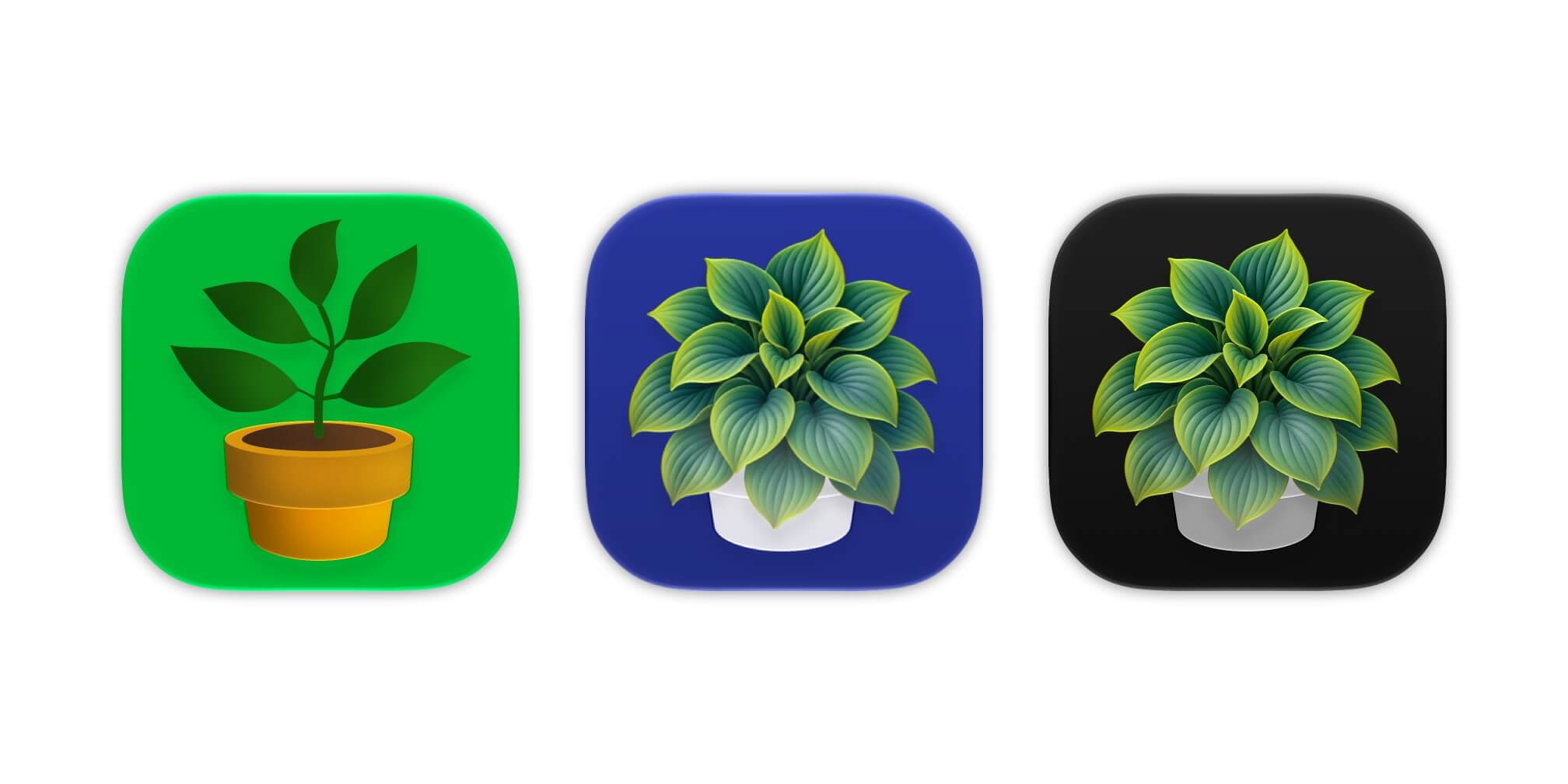
The new icon sports a clump of lush hosta, set in a ceramic pot. You don’t hear people talk about the hosta, but it’s a genuinely underrated family. They have beautiful leaves that goes from green to yellow; some cultivars have blue-ish leaves. It dies back for the winter only to come back dramatically in the spring. It’s the perfect choice for a plant app: it’s not instantly recognizable so the app can be about anything: orchid, your fiddle-leaf fig, your succulents, your veggies and fruits.
And bonus point: the clump of leaves removed the slenderness in the original design. Slenderness is the top enemy with Liquid Glass, primarily because of how the glass effect is rendered.
With iOS 27, I played with how the leaves bends light as layers of glass. The leaves subtly pick up light from the indigo background and the white pot. As it gets more lush at the centre of the clump, the leaves become more vivid and saturated.
Parting thoughts
I don’t usually talk about design because I’m not a designer. I never received proper training on that topic. But I’d like to think I got good eyes. I also adore how much AI has helped me on that front: It used to be impossible to explore different design options without losing focus (or running out of patience).
I love how PlantPal’s new icon stands out in the pack. I also adore the new palette that’s gonna unlock great things down the road. Until next time ✌️